Designing a Mobile App for a Wearable Sensor
We worked with Shade to design an application to complement their wearable sensor technology.
Shade
Wearable sensor technology
IoT Solutions
Product Design
Project Timeline
4 weeks
Design Practices
Mobile App Design, Story Mapping, Information Architecture, Design System Development, User Testing & Validation
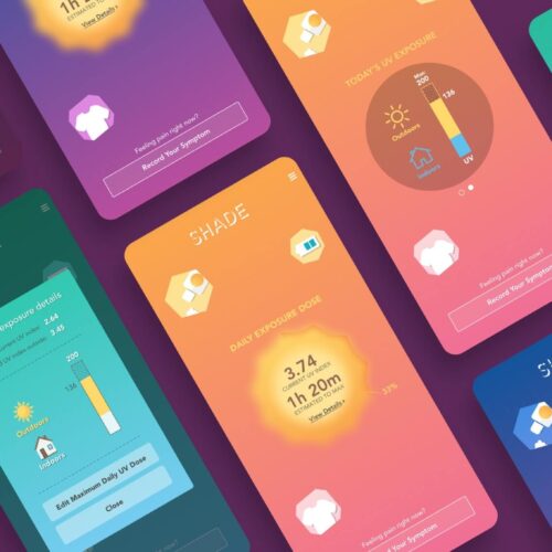
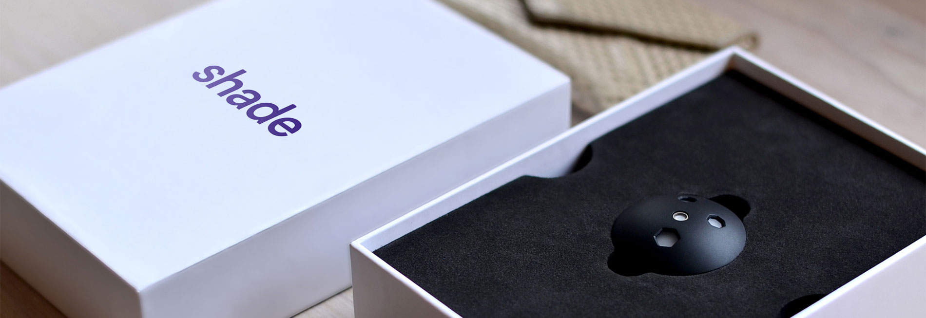
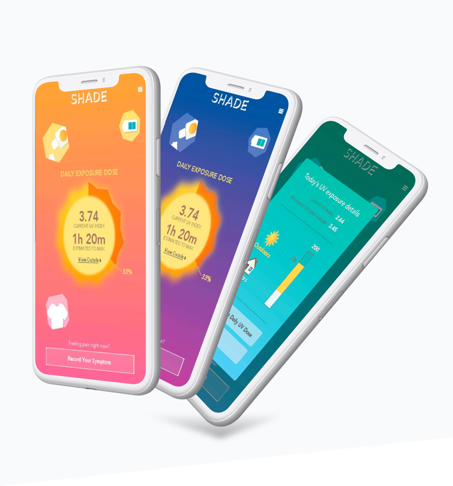
Shade developed the first laboratory-grade wearable device that measures ultraviolet (UV) radiation. We created a powerful user experience (UX) for Shade’s mobile app, making critical data accessible for the people who need it most. The Shade sensor measures and tracks UV exposure. It’s a potentially life-changing tool for patients who are sensitive to UV radiation, but a tool is only as powerful as it is useable.

I highly recommend working with the Very team. They used the perfect user testing methods at the right time, and their work is stunning!
Emmanuel Dumont
Founder, Shade
The Challenge
Shade wanted to build an app that would seamlessly connect the device to a smartphone, so that patients could easily access – and understand – their cumulative UV exposure at any point in the day. The app had to allow for information sharing among other patients and physicians. It was important to Shade that the app’s graphic elements and activities aligned with the established brand standards.
Shade chose to build their app with Very because of our deep experience in outcomes-based design: user testing, validation, workflows, critical paths, interaction, and visual language.
The Process
To fully understand the app we were creating – and the challenges it needed to solve – we built out a See | Do map. A See | Do is a visual representation of what users “See” in each interface and what each component needs to “Do” (or what the expected outcome will be). This facilitates discussion early in the process around API requirements, user flows, core pathways, business workflows, and components – so that every member of the team is on the same page.
Next, we stepped “Into The Grays,” designing Lo-Fi representations of UX elements that would eventually make up wireframes. This meant building a visual language for global UI elements such as components, buttons, button states, titles, and other common interface elements.
User Testing
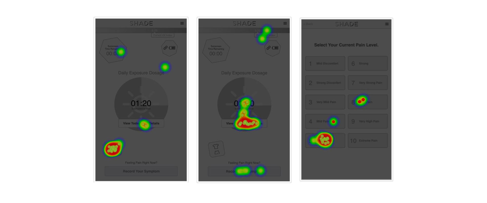
We tested those Lo-Fi prototypes, gathering quick feedback on the proposed experience. As users performed specific tasks on the app, they were asked which layout they preferred.
Our user testing also included click testing, which involves presenting users with a screen, describing a task, and asking where they think they should click in order to complete the task.
We then performed path analysis, where we present a situation to users and see how they navigate a workflow we have designed. This helps us to see how they advance through the pages and if there are any holes or bottlenecks in the process of completing a task.
The Results
Following our tried-and-true processes, we exceeded Shade’s expectations and delivered an experience that was not only engaging, but vetted and validated for usability – well before it hit the market.
Ultimately, we built a product that allowed users to easily interact with sophisticated technology. The result: Shade released their product with confidence, knowing their revolutionary hardware could be used to improve health outcomes and change the way patients manage their own health.
Let's talk about your vision for a powerful IoT solution.